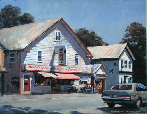
Leeds, oil, 11 x 14 inches
Answer: In my experience, a limited palette can be made out of almost any two or three colors, as long as they're separated from each other on the color wheel. Ideally at one should be cool and the other should be warm.
In this case I often choose the colors that seem most important in the scene. In this case it was the red signs versus the blue of the sky. They're not complements (red and green would be), but they're warm vs. cool.
But when choosing colors, the goal is often not to select which colors you want to include, but rather which ones you want to leave out, for interesting color schemes result from what you've left out of them.
Catskill Roadhouse, East Durham, New York. Casein, 5x8 inches.
Cadmium red scarlet, ultramarine blue, and titanium white over a yellow underpainting.
For this painting I used ultramarine blue and cadmium red scarlet, together with white, and I left out yellow and green. The red and blue colors are near-complements, and I'm painting over a surface primed with yellow. The yellow is about 95% covered up, but where it peeks through, it energizes the color scheme like a pinch of spice.
Here's a video that shows that painting in the works: Link to YouTube.
A two-color-plus-white palette has some advantages:
1. It's extremely fast to set it up and get it running.
2. It's good for beginners because it reduces your choices to light or dark and warm or cool.
3. It puts you into realms of color that you would never think of if you had all the color choices available.
----
TRIADS: Painting with Three Colors" (plus white) is the subject of my recent Gumroad video.


تعليقات
إرسال تعليق