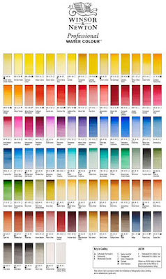
Organic / Inorganic
Pigments are divided into organic (containing carbon) and inorganic (without carbon).
Synthetic pigments
Both organic and inorganic pigments can be manufactured artificially in the lab, and the resulting pigments are for the most part indistinguishable from their natural counterparts.
So, for example, ultramarine is a synthetic replacement for the rare and expensive mineral lapis lazuli. The properties are identical, but the price has become so low that it's used in low cost children's paint.
Light / Deep
When a color is called "light" or "deep," it doesn't only mean light or dark in value. It also has to do with the position on the hue circle. Cadmium yellow deep is more toward red, really orange, while cadmium yellow light is not only lighter in value but also more toward the green side of yellow.
Convenience Colors / Hue
Some pigments are blended to make colors with familiar names such as “mauve” or "peacock blue." Convenience mixtures fill gaps by offering intermediate mixtures for which no pigment exists, such as phthalo yellow-green. In watercolor, Payne’s gray is a blue-black made from black and ultramarine or other blends.
When a color is called a "hue," such as "cerulean blue hue," it's a color that resembles its expensive counterpart, but it's made of a blend of inexpensive ingredients.
Designers Colors
The term "designers color" has been used for a paint color that is meant to match a particular color note. A designers color is made to match not only a hue, but a particular tint or shade and a level of chroma or saturation. Designers colors are often mixed with white to result in colors like "pale rose blush" and "cobalt turquoise light." House paints and hobby acrylics frequently are formulated in this way because people use them right out of the bottle for a given use.
Nowadays most manufacturers of artists' pigments use pure pigments and let you do the adjusting, because you may not want the white in the mixture from the beginning. So if a pigment is naturally transparent, it will still be transparent, even in gouache.
Permanent / Lightfast
The word “permanent” appears on many different art products, but it’s a confusing term. On some graphic art products, such as inks or felt-tipped markers, it really means “waterproof,” rather than “lightfast” (resistant to fading). Many calligraphy or fountain pen inks are not waterproof, but they’re reasonably lightfast, considering that most handwriting isn’t usually subjected to light for long periods.
--
Learn more:
Color terms explained on the website Handprint
Color of art pigment database listed by pigment numbers on website ArtisCreation
Signed copies of my book Color and Light: A Guide for the Realist Painter
Did I get something wrong, or do you have something to add? Please let me know in the comments.

تعليقات
إرسال تعليق