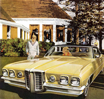
Art Fitzpatrick and Van Kaufman, also known as Fitz and Van, were a team of advertising illustrators whose paintings of new car models were so successful that their car ads changed the fortunes of major car companies in the 1950s and '60s.
When Fitz started as a car illustrator, the standard illustration produced by his competitors showed the car against a white background.
But over the years the mood and setting became extremely important to create the aspirational mood for the upwardly mobile middle class of the postwar era.
Fitz painted the cars and Van painted the backgrounds. The settings evoked an upscale lifestyle of travel and leisure. At one point one of the agency art directors suggested painting the car in a suburban driveway with laundry on the line. Fitz knew that what interested potential customers was a ticket to the "good life," with romantic possibilities, affluent leisure, and no kids.
They demanded and received huge sums for their work. In the late '50s they received from Pontiac about $5,000, at a time when the average annual U.S. household income was about $5,500.
They were rare among advertising illustrators in that they were allowed to sign their work with the initials "AF VK." They also had complete creative control over the car colors and elements of the scene. Fitz had direct contact with the senior management of the car companies, which allowed him to go circumvent the usual approval chain of the ad agencies.
Fitz and Van lived about 40 minutes away from each other in Connecticut. On a typical job, they hired messengers bring the painting back and forth from studio to studio. Van painted the background on illustration board, while the car was painted on a photostat of the comprehensive drawing and rubber cemented onto it so that you could hardly see the join. The interactive reflections came last.
Most of the smooth transitions in the car were were achieved with a brush in gouache. The rare instances when they used an airbrush included the edge of a windshield or a highlight on a chrome bumper. They called those highlights "skinkles," but they tried not to use too many of them. "Skinkles don't make a car look shiny," Fitz said. "Reflections do."
Fitz would start with photos of the car which were taken in Detroit from prototypes on giant turntables so that they wouldn't have to move the camera. The design of the new car models was so secret that the car makers had their own photographers and labs to take the pictures.
To achieve the car's wide, low stance, they stretched the actual car's dimensions. Fitz sliced the photos into vertical sections and spread out the slices horizontally. They also moved the wheels outward in the wheel wells and lowered the ground clearance of the car, which placed the wheels higher in the wheel wells.
They preferred to show the car in a stationary position rather than on the road moving. They made an exception to show the car driving with a "strobing" background, suggesting a photographic effect at night. The agency loved the look and wanted more, but Fitz and Van decided to go back to their proven idea of the casually idled car in the upscale setting. One cardinal rule was never to have anyone looking at or admiring the car.
The settings were based on a huge collection of slides they compiled from their travels. Since the car never actually appeared in the setting, Fitz had to invent how the reflections would look on the mirror-like hood of the car. A given background sets up opportunities for the reflections, not only on the hood of the car, but also on the down-facing planes of the chrome bumper, which picks up the color of the ground.
It was always a challenge to achieve the maximum glossiness of the paint job. Getting a white car to look shiny was the hardest challenge because you're already starting at white. They found it worked best to park the car in shadow, and that's what they did for the 1968 Bonneville. To make sure it was clear that the car's surface color appeared white, they had just a couple spots of dappled light on the front.
These observations come from the new book by Rob Keil called Art Fitzpatrick & Van Kaufman: Masters of the Art of Automobile Advertising. Keil assembled the book over more than a decade of exhaustive research, which included meeting and talking with the the artists and their descendants. The book is full of technical insights and biographical details and gorgeous reproductions, mostly taken from the rare original paintings that have survived.
Art Fitzpatrick & Van Kaufman: Masters of the Art of Automobile Advertising, by author Rob Keil.
---


تعليقات
إرسال تعليق